Chapter 14 AmericasBarometer vignette
For this chapter, load the following packages:
library(tidyverse)
library(survey)
library(srvyr)
library(sf)
library(rnaturalearth)
library(rnaturalearthdata)
library(gt)
library(ggpattern)
This vignette uses a subset of data from the 2021 AmericasBarometer survey. Download the raw files, available on the LAPOP website. We work with version 1.2 of the data, and there are separate files for each of the 22 countries. To import all files into R while ignoring the Stata labels, we recommend running the following code using the read_stata() function from the {haven} package (Wickham, Miller, and Smith 2023):
stata_files <- list.files(here("RawData", "LAPOP_2021"), "*.dta")

read_stata_unlabeled <- function(file) {
  read_stata(file) %>%
    zap_labels() %>%
    zap_label()
}

ambarom_in <- here("RawData", "LAPOP_2021", stata_files) %>%
  map_df(read_stata_unlabeled) %>%
  select(pais, strata, upm, weight1500, strata, core_a_core_b,
         q2, q1tb, covid2at, a4, idio2, idio2cov, it1, jc13,
         m1, mil10a, mil10e, ccch1, ccch3, ccus1, ccus3,
         edr, ocup4a, q14, q11n, q12c, q12bn,
         starts_with("covidedu1"), gi0n,
         r15, r18n, r18)
The code above reads all the .dta files and combines them into one tibble.
14.1 Introduction
The AmericasBarometer surveys, conducted by the LAPOP Lab (LAPOP 2023b), are public opinion surveys of the Americas focused on democracy. The study was launched in 2004/2005 with 11 countries. Though the participating countries change over time, AmericasBarometer maintains a consistent methodology across many of them. In 2021, the study included 22 countries ranging from Canada in the north to Chile and Argentina in the south (LAPOP 2023a).
Historically, surveys were administered through in-person household interviews, but the COVID-19 pandemic changed the study significantly. Now, random-digit dialing (RDD) of mobile phones is used in all countries except the United States and Canada (LAPOP 2021c). In Canada, LAPOP collaborated with the Environics Institute to collect data from a panel of Canadians using a web survey (LAPOP 2021a). In the United States, YouGov conducted a web survey on behalf of LAPOP among its panelists (LAPOP 2021b).
The survey includes a core set of questions for all countries, but not every question is asked in each country. Additionally, some questions are only posed to half of the respondents in a country, with different randomized sections (LAPOP 2021d).
14.2 Data structure
Each country and year has its own file available in Stata format (.dta). In this vignette, we download and combine all the data from the 22 participating countries in 2021. We subset the data to a smaller set of columns, as noted in the Prerequisites box. We recommend reviewing the core questionnaire to understand the common variables across the countries (LAPOP 2021d).
14.3 Preparing files
Many of the variables are coded as numeric and do not have intuitive variable names, so the next step is to create derived variables and wrangle the data for analysis. Using the core questionnaire as a codebook, we reference the factor descriptions to create derived variables with informative names:
ambarom <- ambarom_in %>%
  mutate(
    Country = factor(
      case_match(
        pais,
        1 ~ "Mexico",
        2 ~ "Guatemala",
        3 ~ "El Salvador",
        4 ~ "Honduras",
        5 ~ "Nicaragua",
        6 ~ "Costa Rica",
        7 ~ "Panama",
        8 ~ "Colombia",
        9 ~ "Ecuador",
        10 ~ "Bolivia",
        11 ~ "Peru",
        12 ~ "Paraguay",
        13 ~ "Chile",
        14 ~ "Uruguay",
        15 ~ "Brazil",
        17 ~ "Argentina",
        21 ~ "Dominican Republic",
        22 ~ "Haiti",
        23 ~ "Jamaica",
        24 ~ "Guyana",
        40 ~ "United States",
        41 ~ "Canada"
      )
    ),
    CovidWorry = fct_reorder(
      case_match(
        covid2at,
        1 ~ "Very worried",
        2 ~ "Somewhat worried",
        3 ~ "A little worried",
        4 ~ "Not worried at all"
      ),
      covid2at,
      .na_rm = FALSE
    )
  ) %>%
  rename(
    Educ_NotInSchool = covidedu1_1,
    Educ_NormalSchool = covidedu1_2,
    Educ_VirtualSchool = covidedu1_3,
    Educ_Hybrid = covidedu1_4,
    Educ_NoSchool = covidedu1_5,
    BroadbandInternet = r18n,
    Internet = r18
  )
At this point, it is a good time to check the cross-tabs between the original and newly derived variables. These tables help us confirm that we have correctly matched the numeric data from the original dataset to the renamed factor data in the new dataset. For instance, let’s check the original variable pais and the derived variable Country. We can consult the questionnaire or codebook to confirm that Argentina is coded as 17, Bolivia as 10, etc. Similarly, for CovidWorry and covid2at, we can verify that Very worried is coded as 1, and so on for the other variables.
## # A tibble: 22 × 3
##    Country             pais     n
##    <fct>              <dbl> <int>
##  1 Argentina             17  3011
##  2 Bolivia               10  3002
##  3 Brazil                15  3016
##  4 Canada                41  2201
##  5 Chile                 13  2954
##  6 Colombia               8  2993
##  7 Costa Rica             6  2977
##  8 Dominican Republic    21  3000
##  9 Ecuador                9  3005
## 10 El Salvador            3  3245
## 11 Guatemala              2  3000
## 12 Guyana                24  3011
## 13 Haiti                 22  3088
## 14 Honduras               4  2999
## 15 Jamaica               23  3121
## 16 Mexico                 1  2998
## 17 Nicaragua              5  2997
## 18 Panama                 7  3183
## 19 Paraguay              12  3004
## 20 Peru                  11  3038
## 21 United States         40  1500
## 22 Uruguay 14 3009## # A tibble: 5 × 3
## CovidWorry covid2at n
## <fct> <dbl> <int>
## 1 Very worried 1 24327
## 2 Somewhat worried 2 13233
## 3 A little worried 3 11478
## 4 Not worried at all 4 8628
## 5 <NA> NA 668614.4 Survey design objects
The technical report is the best reference for understanding how to specify the sampling design in R (LAPOP 2021c). The data include two weights: wt and weight1500. The first weight variable is specific to each country and sums to the sample size, but it is calibrated to reflect each country’s demographics. The second weight variable sums to 1500 for each country and is recommended for multi-country analyses. Although not explicitly stated in the documentation, the Stata syntax example (svyset upm [pw=weight1500], strata(strata)) indicates the variable upm is a clustering variable, and strata is the strata variable. Therefore, the design object for multi-country analysis is created in R as follows:
One interesting thing to note is that these weight variables can provide estimates for comparing countries but not for multi-country estimates. This is due to the fact that the weights do not account for the different sizes of countries. For example, Canada has about 10% of the population of the United States, but an estimate that uses records from both countries would weigh them equally.
14.5 Calculating estimates
When calculating estimates from the data, we use the survey design object ambarom_des and then apply the survey_mean() function. The next sections walk through a few examples.
14.5.1 Example: Worry about COVID-19
This survey was administered between March and August 2021, with the specific timing varying by country30. Given the state of the pandemic at that time, several questions about COVID-19 were included. According to the core questionnaire (LAPOP 2021d), the first question asked about COVID-19 was:
How worried are you about the possibility that you or someone in your household will get sick from coronavirus in the next 3 months?
- Very worried
- Somewhat worried
- A little worried
- Not worried at all
If we are interested in those who are very worried or somewhat worried, we can create a new variable (CovidWorry_bin) that groups levels of the original question using the fct_collapse() function from the {forcats} package (Wickham 2023). We then use the survey_count() function to understand how responses are distributed across each category of the original variable (CovidWorry) and the new variable (CovidWorry_bin).
covid_worry_collapse <- ambarom_des %>%
  mutate(CovidWorry_bin = fct_collapse(
    CovidWorry,
    WorriedHi = c("Very worried", "Somewhat worried"),
    WorriedLo = c("A little worried", "Not worried at all")
  ))

covid_worry_collapse %>%
  survey_count(CovidWorry_bin, CovidWorry)
## # A tibble: 5 × 4
## CovidWorry_bin CovidWorry n n_se
## <fct> <fct> <dbl> <dbl>
## 1 WorriedHi Very worried 12369. 83.6
## 2 WorriedHi Somewhat worried 6378. 63.4
## 3 WorriedLo A little worried 5896. 62.6
## 4 WorriedLo Not worried at all 4840. 59.7
## 5 <NA> <NA> 3518. 42.2With this new variable, we can now use survey_mean() to calculate the percentage of people in each country who are either very or somewhat worried about COVID-19. There are missing data, as indicated in the survey_count() output above, so we need to use na.rm = TRUE in the survey_mean() function to handle the missing values.
covid_worry_country_ests <- covid_worry_collapse %>%
  group_by(Country) %>%
  summarize(p = survey_mean(CovidWorry_bin == "WorriedHi",
    na.rm = TRUE
  ) * 100)

covid_worry_country_ests
## # A tibble: 22 × 3
## Country p p_se
## <fct> <dbl> <dbl>
## 1 Argentina 65.8 1.08
## 2 Bolivia 71.6 0.960
## 3 Brazil 83.5 0.962
## 4 Canada 48.9 1.34
## 5 Chile 81.8 0.828
## 6 Colombia 67.9 1.12
## 7 Costa Rica 72.6 0.952
## 8 Dominican Republic 50.1 1.13
## 9 Ecuador 71.7 0.967
## 10 El Salvador 52.5 1.02
## # ℹ 12 more rows
To view the results for all countries, we can use the {gt} package to create Table 14.1 (Iannone et al. 2025).
covid_worry_country_ests_gt <- covid_worry_country_ests %>%
  gt(rowname_col = "Country") %>%
  cols_label(
    p = "%",
    p_se = "S.E."
  ) %>%
  fmt_number(decimals = 1) %>%
tab_source_note(md("*Source*: AmericasBarometer Surveys, 2021"))| % | S.E. | |
|---|---|---|
| Argentina | 65.8 | 1.1 |
| Bolivia | 71.6 | 1.0 |
| Brazil | 83.5 | 1.0 |
| Canada | 48.9 | 1.3 |
| Chile | 81.8 | 0.8 |
| Colombia | 67.9 | 1.1 |
| Costa Rica | 72.6 | 1.0 |
| Dominican Republic | 50.1 | 1.1 |
| Ecuador | 71.7 | 1.0 |
| El Salvador | 52.5 | 1.0 |
| Guatemala | 69.3 | 1.0 |
| Guyana | 60.0 | 1.6 |
| Haiti | 54.4 | 1.8 |
| Honduras | 64.6 | 1.1 |
| Jamaica | 28.4 | 0.9 |
| Mexico | 63.6 | 1.0 |
| Nicaragua | 80.0 | 1.0 |
| Panama | 70.2 | 1.0 |
| Paraguay | 61.5 | 1.1 |
| Peru | 77.1 | 2.5 |
| United States | 46.6 | 1.7 |
| Uruguay | 60.9 | 1.1 |
| Source: AmericasBarometer Surveys, 2021 | ||
14.5.2 Example: Education affected by COVID-19
In the core questionnaire (LAPOP 2021d), respondents were also asked a question about how the pandemic affected education. This question was asked to households with children under the age of 13, and respondents could select more than one option, as follows:
Did any of these children have their school education affected due to the pandemic?
- No, because they are not yet school age or because they do not attend school for another reason
- No, their classes continued normally
- Yes, they went to virtual or remote classes
- Yes, they switched to a combination of virtual and in-person classes
- Yes, they cut all ties with the school
Working with multiple-choice questions can be both challenging and interesting. Let’s walk through how to analyze this question. If we are interested in the impact on education, we should focus on the data of those whose children are attending school. This means we need to exclude those who selected the first response option: “No, because they are not yet school age or because they do not attend school for another reason.” To do this, we use the Educ_NotInSchool variable in the dataset, which has values of 0 and 1. A value of 1 indicates that the respondent chose the first response option (none of the children are in school), and a value of 0 means that at least one of their children is in school. By filtering the data to those with a value of 0 (they have at least one child in school), we can consider only respondents with at least one child attending school.
Now, let’s review the data for those who selected one of the next three response options:
- No, their classes continued normally:
Educ_NormalSchool - Yes, they went to virtual or remote classes:
Educ_VirtualSchool - Yes, they switched to a combination of virtual and in-person classes:
Educ_Hybrid
The unweighted cross-tab for these responses is included below. It reveals a wide range of impacts, where many combinations of effects on education are possible.
ambarom %>%
  filter(Educ_NotInSchool == 0) %>%
  count(
    Educ_NormalSchool,
    Educ_VirtualSchool,
    Educ_Hybrid
  )
## # A tibble: 8 × 4
## Educ_NormalSchool Educ_VirtualSchool Educ_Hybrid n
## <dbl> <dbl> <dbl> <int>
## 1 0 0 0 861
## 2 0 0 1 1192
## 3 0 1 0 7554
## 4 0 1 1 280
## 5 1 0 0 833
## 6 1 0 1 18
## 7 1 1 0 72
## 8 1 1 1 7In reviewing the survey question, we might be interested in knowing the answers to the following:
- What percentage of households indicated that school continued as normal with no virtual or hybrid option?
- What percentage of households indicated that the education medium was changed to either virtual or hybrid?
- What percentage of households indicated that they cut ties with their school?
To find the answers, we create indicators for the first two questions, make national estimates for all three questions, and then construct a summary table for easy viewing. First, we create and inspect the indicators and their distributions using survey_count().
ambarom_des_educ <- ambarom_des %>%
  filter(Educ_NotInSchool == 0) %>%
  mutate(
    Educ_OnlyNormal = (Educ_NormalSchool == 1 &
      Educ_VirtualSchool == 0 &
      Educ_Hybrid == 0),
    Educ_MediumChange = (Educ_VirtualSchool == 1 |
      Educ_Hybrid == 1)
  )

ambarom_des_educ %>%
  survey_count(
    Educ_OnlyNormal,
    Educ_NormalSchool,
    Educ_VirtualSchool,
    Educ_Hybrid
  )
## # A tibble: 8 × 6
## Educ_OnlyNormal Educ_NormalSchool Educ_VirtualSchool Educ_Hybrid
## <lgl> <dbl> <dbl> <dbl>
## 1 FALSE 0 0 0
## 2 FALSE 0 0 1
## 3 FALSE 0 1 0
## 4 FALSE 0 1 1
## 5 FALSE 1 0 1
## 6 FALSE 1 1 0
## 7 FALSE 1 1 1
## 8 TRUE 1 0 0
## # ℹ 2 more variables: n <dbl>, n_se <dbl>## # A tibble: 4 × 5
## Educ_MediumChange Educ_VirtualSchool Educ_Hybrid n n_se
## <lgl> <dbl> <dbl> <dbl> <dbl>
## 1 FALSE 0 0 880. 26.1
## 2 TRUE 0 1 561. 19.2
## 3 TRUE 1 0 3812. 49.4
## 4 TRUE 1 1 136. 9.86Next, we group the data by country and calculate the population estimates for our three questions.
covid_educ_ests <-
  ambarom_des_educ %>%
  group_by(Country) %>%
  summarize(
    p_onlynormal = survey_mean(Educ_OnlyNormal, na.rm = TRUE) * 100,
    p_mediumchange = survey_mean(Educ_MediumChange, na.rm = TRUE) * 100,
    p_noschool = survey_mean(Educ_NoSchool, na.rm = TRUE) * 100,
  )

covid_educ_ests
## # A tibble: 16 × 7
## Country p_onlynormal p_onlynormal_se p_mediumchange p_mediumchange_se
## <fct> <dbl> <dbl> <dbl> <dbl>
## 1 Argent… 5.39 1.14 87.1 1.72
## 2 Brazil 4.28 1.17 81.5 2.33
## 3 Chile 0.715 0.267 96.2 0.962
## 4 Colomb… 2.84 0.727 90.3 1.40
## 5 Domini… 3.75 0.793 87.4 1.45
## 6 Ecuador 5.18 0.963 87.5 1.39
## 7 El Sal… 2.92 0.680 85.8 1.53
## 8 Guatem… 3.00 0.727 82.2 1.73
## 9 Guyana 3.34 0.702 85.3 1.67
## 10 Haiti 81.1 2.25 7.25 1.48
## 11 Hondur… 3.68 0.882 80.7 1.72
## 12 Jamaica 5.42 0.950 88.1 1.43
## 13 Panama 7.20 1.18 89.4 1.42
## 14 Paragu… 4.66 0.939 90.7 1.37
## 15 Peru 2.04 0.604 91.8 1.20
## 16 Uruguay 8.60 1.40 84.3 2.02
## # ℹ 2 more variables: p_noschool <dbl>, p_noschool_se <dbl>
Finally, to view the results for all countries, we can use the {gt} package to construct Table 14.2.
covid_educ_ests_gt <- covid_educ_ests %>%
  gt(rowname_col = "Country") %>%
  cols_label(
    p_onlynormal = "%",
    p_onlynormal_se = "S.E.",
    p_mediumchange = "%",
    p_mediumchange_se = "S.E.",
    p_noschool = "%",
    p_noschool_se = "S.E."
  ) %>%
  tab_spanner(
    label = "Normal School Only",
    columns = c("p_onlynormal", "p_onlynormal_se")
  ) %>%
  tab_spanner(
    label = "Medium Change",
    columns = c("p_mediumchange", "p_mediumchange_se")
  ) %>%
  tab_spanner(
    label = "Cut Ties with School",
    columns = c("p_noschool", "p_noschool_se")
  ) %>%
  fmt_number(decimals = 1) %>%
tab_source_note(md("*Source*: AmericasBarometer Surveys, 2021"))| Normal School Only | Medium Change | Cut Ties with School | ||||
|---|---|---|---|---|---|---|
| % | S.E. | % | S.E. | % | S.E. | |
| Argentina | 5.4 | 1.1 | 87.1 | 1.7 | 9.9 | 1.6 |
| Brazil | 4.3 | 1.2 | 81.5 | 2.3 | 22.1 | 2.5 |
| Chile | 0.7 | 0.3 | 96.2 | 1.0 | 4.0 | 1.0 |
| Colombia | 2.8 | 0.7 | 90.3 | 1.4 | 7.5 | 1.3 |
| Dominican Republic | 3.8 | 0.8 | 87.4 | 1.5 | 10.5 | 1.4 |
| Ecuador | 5.2 | 1.0 | 87.5 | 1.4 | 7.9 | 1.1 |
| El Salvador | 2.9 | 0.7 | 85.8 | 1.5 | 11.8 | 1.4 |
| Guatemala | 3.0 | 0.7 | 82.2 | 1.7 | 17.7 | 1.8 |
| Guyana | 3.3 | 0.7 | 85.3 | 1.7 | 13.0 | 1.6 |
| Haiti | 81.1 | 2.3 | 7.2 | 1.5 | 11.7 | 1.8 |
| Honduras | 3.7 | 0.9 | 80.7 | 1.7 | 16.9 | 1.6 |
| Jamaica | 5.4 | 0.9 | 88.1 | 1.4 | 7.5 | 1.2 |
| Panama | 7.2 | 1.2 | 89.4 | 1.4 | 3.8 | 0.9 |
| Paraguay | 4.7 | 0.9 | 90.7 | 1.4 | 6.4 | 1.2 |
| Peru | 2.0 | 0.6 | 91.8 | 1.2 | 6.8 | 1.1 |
| Uruguay | 8.6 | 1.4 | 84.3 | 2.0 | 8.0 | 1.6 |
| Source: AmericasBarometer Surveys, 2021 | ||||||
In the countries that were asked this question, many households experienced a change in their child’s education medium. However, in Haiti, only 7.2% of households with children switched to virtual or hybrid learning.
14.6 Mapping survey data
While the table effectively presents the data, a map could also be insightful. To create a map of the countries, we can use the package {rnaturalearth} and subset North and South America with the ne_countries() function (Massicotte and South 2023). The function returns a simple features (sf) object with many columns (Pebesma and Bivand 2023), but most importantly, soverignt (sovereignty), geounit (country or territory), and geometry (the shape). For an example of the difference between sovereignty and country/territory, the United States, Puerto Rico, and the U.S. Virgin Islands are all separate units with the same sovereignty. A map without data is plotted in Figure 14.1 using geom_sf() from the {ggplot2} package, which plots sf objects (Wickham 2016).
country_shape <-
  ne_countries(
    scale = "medium",
    returnclass = "sf",
    continent = c("North America", "South America")
  )

country_shape %>%
  ggplot() +
  geom_sf()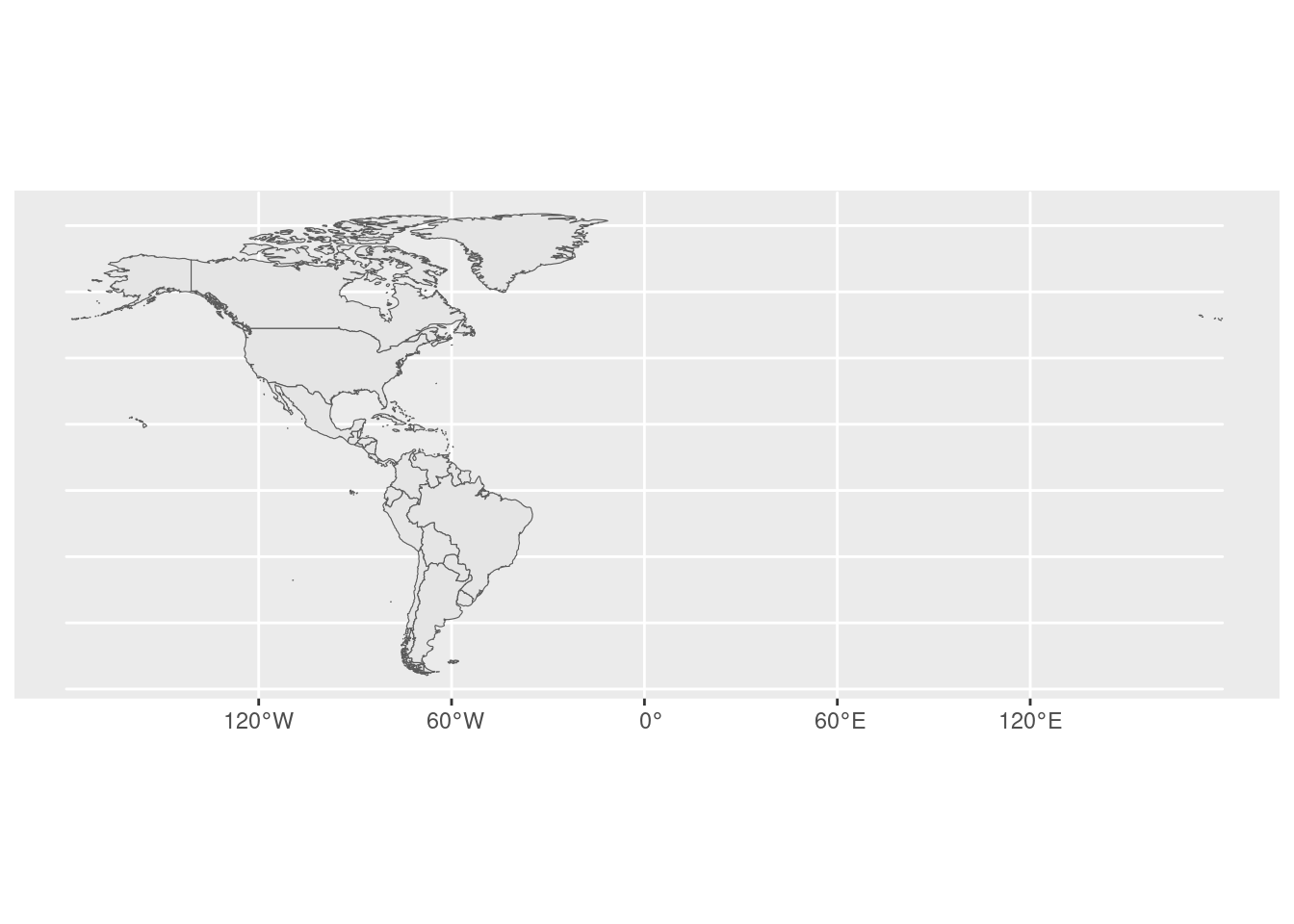
FIGURE 14.1: Map of North and South America
The map in Figure 14.1 appears very wide due to the Aleutian Islands in Alaska extending into the Eastern Hemisphere. We can crop the shapefile to include only the Western Hemisphere using st_crop() from the {sf} package, which removes some of the trailing islands of Alaska.
Now that we have the necessary shape files, our next step is to match our survey data to the map. Countries can be named differently (e.g., “U.S.”, “U.S.A.”, “United States”). To make sure we can visualize our survey data on the map, we need to match the country names in both the survey data and the map data. To do this, we can use the anti_join() function from the {dplyr} package to identify the countries in the survey data that are not in the map data. Table 14.3 shows the countries in the survey data but not the map data, and Table 14.4 shows the countries in the map data but not the survey data. As shown below, the United States is referred to as “United States” in the survey data but “United States of America” in the map data.
survey_country_list <- ambarom %>% distinct(Country)

survey_country_list_gt <- survey_country_list %>%
  anti_join(country_shape_crop, by = c("Country" = "geounit")) %>%
gt()| Country |
|---|
| United States |
map_country_list_gt <- country_shape_crop %>%
  as_tibble() %>%
  select(geounit, sovereignt) %>%
  anti_join(survey_country_list, by = c("geounit" = "Country")) %>%
  arrange(geounit) %>%
gt()| geounit | sovereignt |
|---|---|
| Anguilla | United Kingdom |
| Antigua and Barbuda | Antigua and Barbuda |
| Aruba | Netherlands |
| Barbados | Barbados |
| Belize | Belize |
| Bermuda | United Kingdom |
| British Virgin Islands | United Kingdom |
| Cayman Islands | United Kingdom |
| Cuba | Cuba |
| Curaçao | Netherlands |
| Dominica | Dominica |
| Falkland Islands | United Kingdom |
| Greenland | Denmark |
| Grenada | Grenada |
| Montserrat | United Kingdom |
| Puerto Rico | United States of America |
| Saint Barthelemy | France |
| Saint Kitts and Nevis | Saint Kitts and Nevis |
| Saint Lucia | Saint Lucia |
| Saint Martin | France |
| Saint Pierre and Miquelon | France |
| Saint Vincent and the Grenadines | Saint Vincent and the Grenadines |
| Sint Maarten | Netherlands |
| Suriname | Suriname |
| The Bahamas | The Bahamas |
| Trinidad and Tobago | Trinidad and Tobago |
| Turks and Caicos Islands | United Kingdom |
| United States Virgin Islands | United States of America |
| United States of America | United States of America |
| Venezuela | Venezuela |
There are several ways to fix the mismatched names for a successful join. The simplest solution is to rename the data in the shape object before merging. Since only one country name in the survey data differs from the map data, we rename the map data accordingly.
country_shape_upd <- country_shape_crop %>%
  mutate(geounit = if_else(geounit == "United States of America",
    "United States", geounit
  ))
Now that the country names match, we can merge the survey and map data and then plot the resulting dataset. We begin with the map file and merge it with the survey estimates generated in Section 14.5 (covid_worry_country_ests and covid_educ_ests). We use the {dplyr} function of full_join(), which joins the rows in the map data and the survey estimates based on the columns geounit and Country. A full join keeps all the rows from both datasets, matching rows when possible. For any rows without matches, the function fills in an NA for the missing value (Pebesma and Bivand 2023).
covid_sf <- country_shape_upd %>%
  full_join(covid_worry_country_ests,
    by = c("geounit" = "Country")
  ) %>%
  full_join(covid_educ_ests,
    by = c("geounit" = "Country")
  )
After the merge, we create two figures that display the population estimates for the percentage of people worried about COVID-19 (Figure 14.2) and the percentage of households with at least one child participating in virtual or hybrid learning (Figure 14.3). We also add a crosshatch pattern to the countries without any data using the geom_sf_pattern() function from the {ggpattern} package (FC, Davis, and ggplot2 authors 2022).
ggplot() +
  geom_sf(
    data = covid_sf,
    aes(fill = p, geometry = geometry),
    color = "darkgray"
  ) +
  scale_fill_gradientn(
    guide = "colorbar",
    name = "Percent",
    labels = scales::comma,
    colors = c("#BFD7EA", "#087e8b", "#0B3954"),
    na.value = NA
  ) +
  geom_sf_pattern(
    data = filter(covid_sf, is.na(p)),
    pattern = "crosshatch",
    pattern_fill = "lightgray",
    pattern_color = "lightgray",
    fill = NA,
    color = "darkgray"
  ) +
  theme_minimal()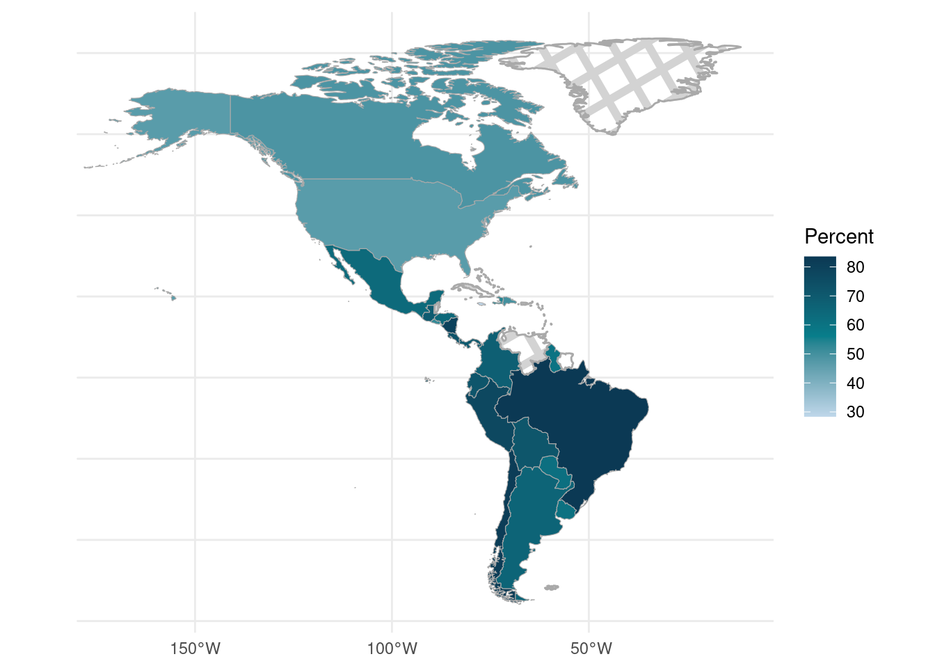
FIGURE 14.2: Percentage of households by country worried someone in their household will get COVID-19 in the next 3 months
ggplot() +
  geom_sf(
    data = covid_sf,
    aes(fill = p_mediumchange, geometry = geometry),
    color = "darkgray"
  ) +
  scale_fill_gradientn(
    guide = "colorbar",
    name = "Percent",
    labels = scales::comma,
    colors = c("#BFD7EA", "#087e8b", "#0B3954"),
    na.value = NA
  ) +
  geom_sf_pattern(
    data = filter(covid_sf, is.na(p_mediumchange)),
    pattern = "crosshatch",
    pattern_fill = "lightgray",
    pattern_color = "lightgray",
    fill = NA,
    color = "darkgray"
  ) +
  theme_minimal()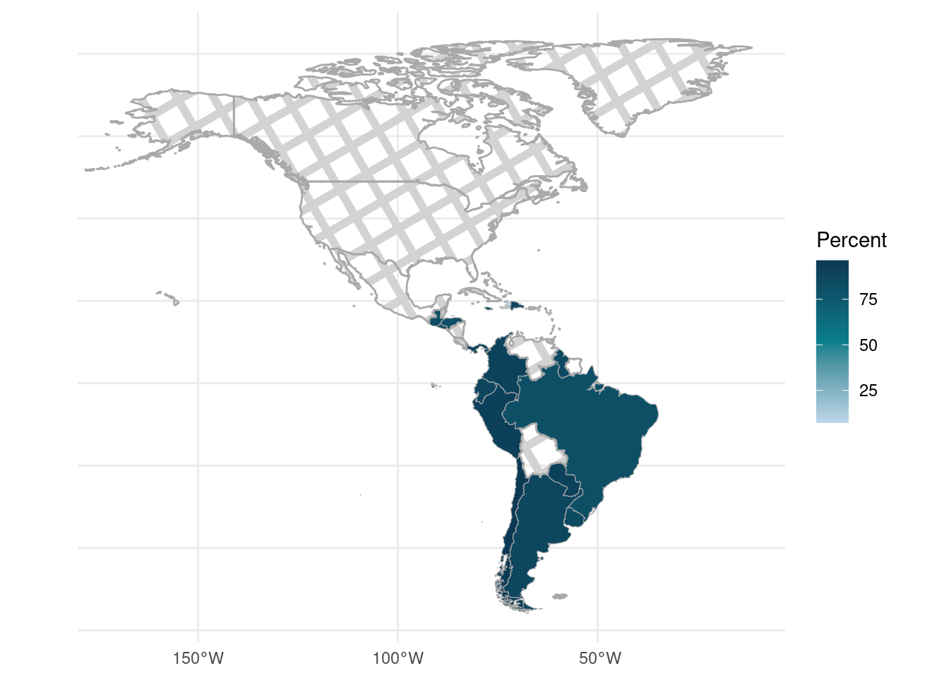
FIGURE 14.3: Percentage of households by country who had at least one child participate in virtual or hybrid learning
In Figure 14.3, we observe missing data (represented by the crosshatch pattern) for Canada, Mexico, and the United States. The questionnaires indicate that these three countries did not include the education question in the survey. To focus on countries with available data, we can remove North America from the map and show only Central and South America. We do this below by restricting the shape files to Latin America and the Caribbean, as depicted in Figure 14.4.
covid_c_s <- covid_sf %>%
  filter(region_wb == "Latin America & Caribbean")

ggplot() +
  geom_sf(
    data = covid_c_s,
    aes(fill = p_mediumchange, geometry = geometry),
    color = "darkgray"
  ) +
  scale_fill_gradientn(
    guide = "colorbar",
    name = "Percent",
    labels = scales::comma,
    colors = c("#BFD7EA", "#087e8b", "#0B3954"),
    na.value = NA
  ) +
  geom_sf_pattern(
    data = filter(covid_c_s, is.na(p_mediumchange)),
    pattern = "crosshatch",
    pattern_fill = "lightgray",
    pattern_color = "lightgray",
    fill = NA,
    color = "darkgray"
  ) +
  theme_minimal()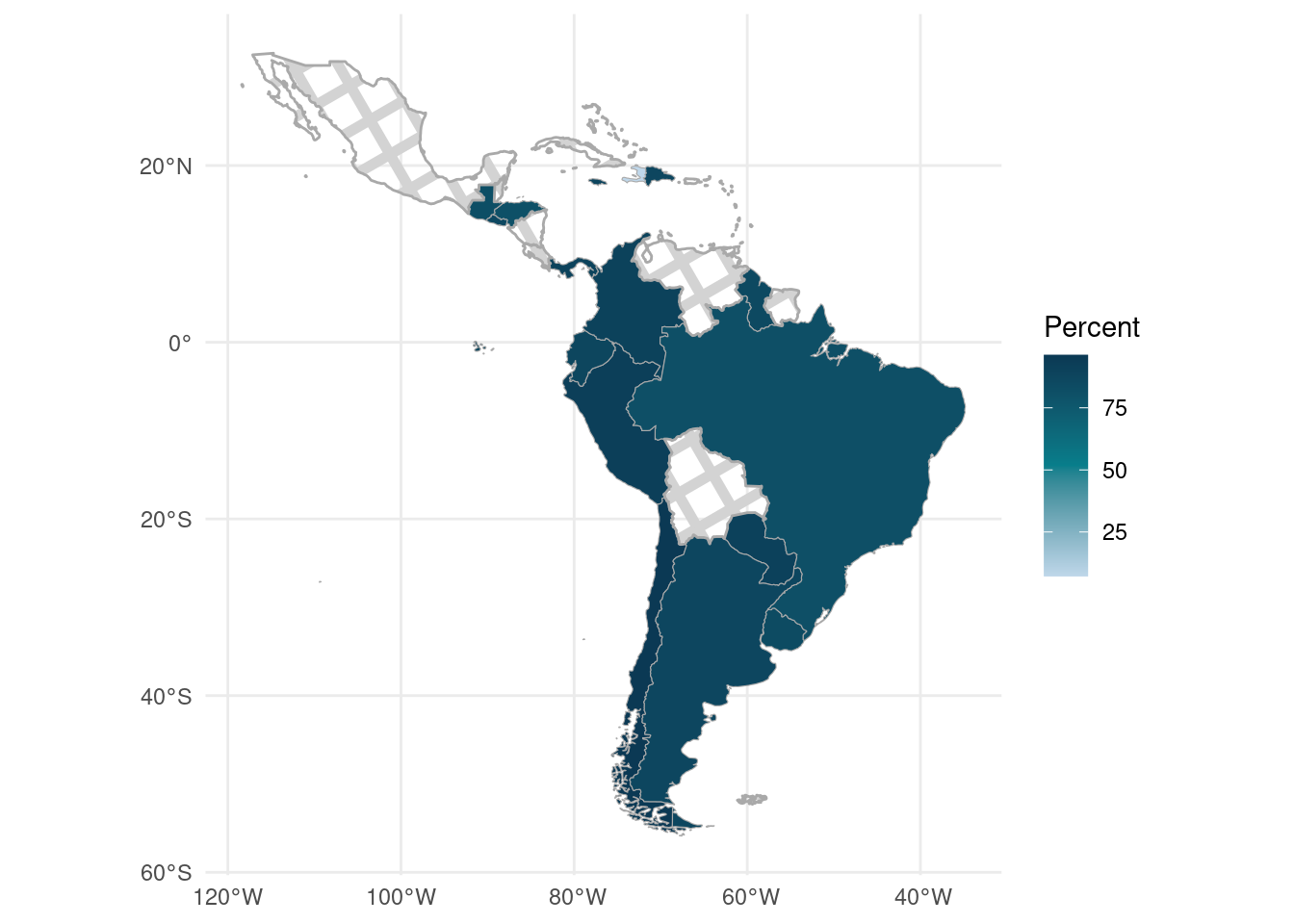
FIGURE 14.4: Percentage of households who had at least one child participate in virtual or hybrid learning, in Central and South America
In Figure 14.4, we can see that most countries with available data have similar percentages (reflected in their similar shades). However, Haiti stands out with a lighter shade, indicating a considerably lower percentage of households with at least one child participating in virtual or hybrid learning.
14.7 Exercises
Calculate the percentage of households with broadband internet and those with any internet at home, including from a phone or tablet in Latin America and the Caribbean. Hint: if there are countries with 0% internet usage, try filtering by something first.
Create a faceted map showing both broadband internet and any internet usage.